The newsletter 700K female entrepreneurs love | Email Breakdown with Emily Oberman
In this episode I’m thrilled to be joined by Emily Oberman, Founder of The Content Atelier, a digital content strategist and systems expert, who specializes in long-form content like newsletters, email marketing, podcasts, and websites.
We’re diving into a newsletter from Create & Cultivate, a brand known for producing industry-leading events and content, providing the tools, connections, and resources to advance women personally and professionally. Emily has been on their email list for years, ever since contributing an article about content repurposing, so she’s been able to watch their email strategy evolve over time.
First Impressions
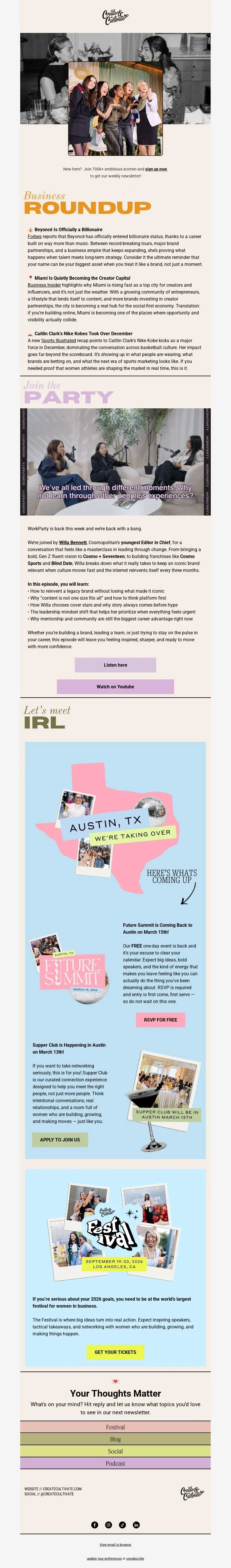
The subject line of this email is “The B Stands for Billionaire” and it immediately caught both our attention. Emily described it as bold, and I agree. It is eye-catching without tipping into clickbait. It feels aspirational rather than salesy, which is an important line to walk when you are talking to women entrepreneurs, creatives and small business owners.
It also does something clever. It sparks curiosity without giving everything away. You want to open the email to understand what “Billionaire” actually means in this context, and that is exactly the job of a subject line.
From a design point of view, Create & Cultivate are incredibly consistent. Their emails look like an extension of their website, which sounds obvious, but it is something a lot of brands still do not get right. Fun, colourful and considered, it all feels intentional.
Emily pointed out that their header images often centre around events, which makes sense given events are such a big part of their business model. In this particular email, the black-and-white header image adds a nostalgic, slightly vintage feel. That is not accidental.
Nostalgia is everywhere in marketing right now. From remakes in film and TV to retro-inspired Instagram feeds, it works because it makes people feel safe, familiar and emotionally connected. In email, that matters. When your inbox already feels overwhelming, anything that feels comforting and familiar has an edge.
What I also love here is the balance. While short-form, five-second content dominates social media, newsletters like this remind us that people still want depth, just not overload. Long-form content works when it is curated, intentional and easy to consume.
Breaking down the email content
1. Business roundup
This section delivers three clear pieces of content.
Beyoncé. Pop culture with business relevance.
Miami as a creator capital. Industry insight.
Caitlyn Clark and Nike. Sport meets business.
Emily compared this to The Skimm, and I think that is spot on. It is conversational, skimmable and, most importantly, edited. They are not trying to cover everything. Just the three things you probably want to know this week.
One detail I really appreciate is the choice of sources. Forbes, Business Insider and Sports Illustrated are all recognisable and trustworthy publications. Even better, the links are not hidden behind paywalls. That might sound small, but it matters. Nothing breaks trust faster than clicking a link and hitting a dead end.
Tangible takeaway!
If you are curating content in your newsletter, do not just think about what you are linking to. Think about the experience after the click. Accessible, credible sources build trust, encourage clicks and increase the chances people will keep opening your emails.
2. Multimedia section
Next up is a podcast and YouTube feature. Instead of a standard static YouTube thumbnail, they have used a GIF, which immediately signals that this is video content without feeling clunky.
What works particularly well here is the choice to offer two clear options, listen or watch. We talk a lot about not overwhelming people with too many calls to action, but this is a good example of where two makes sense. Some people want something for their commute, others want something visual. This respects both.
I would be genuinely curious to see their click data here, but from a strategy point of view, it is a strong approach.
Tangible takeaway!
If you are repurposing content across formats, do not force everyone down one path. Make it easy for people to consume your content in the way that suits their life, not the way that suits your platform preference.
3. Events section
This is an area where I have seen Create & Cultivate evolve. Previously, much of this section relied on images with text baked in. In this email, they have moved to live text and columns, which is a big win for accessibility and usability.
What I love is that they have kept the collage-style, retro aesthetic while making the content easier to scan and interact with. Disco balls, Polaroids and playful imagery all feel on brand without getting in the way of clarity.
We talked about decision fatigue here, because there are multiple events being promoted. It is handled well. Subtle colour changes and layout choices group events by location, Austin versus Los Angeles, which helps your brain categorise information without you even realising it.
Tangible takeaway!
If your newsletter includes multiple offers or events, think in terms of visual grouping. Colour, spacing and layout can do a lot of the heavy lifting so your reader does not feel like they have to work to understand what is going on.
Footer and final thoughts
The footer includes multiple calls to action. This would feel like too much in a sales email, but it works in a newsletter context. At this point, the reader is already in browsing mode.
Emily did note some tight spacing between sections, and I agree. A little more breathing room would improve mobile readability. That said, it does not detract from the overall experience.
What this email does really well is combine emotion, through nostalgia, with utility, through clear and credible content. It is enjoyable to look at and worth reading, which is exactly what you want if you are playing the long game with subscriber retention.
Key takeaways
Subject lines should spark curiosity without over-promising.
Nostalgia works because it creates emotional safety and familiarity.
Curated content beats “everything you need to know”.
Source credibility and accessibility build trust.
Multiple calls to action can work in newsletters when the structure is clear.
Small design decisions have a big impact on how easy an email feels to read.
Create & Cultivate’s newsletter is a great reminder that your emails do not need to shout to be effective. When design, content and audience understanding are aligned, even a busy inbox can feel like a place people want to spend time.
Want your own (private!) email review? I can SHOW you what works, what doesn’t, and how you can make sure YOUR emails convert. I teardown your emails, so that you can build them up bigger and better - CLICK HERE!